
Laying out a word clock face
With a word clock the front panel decides everything. Two mistakes cost almost everyone their first attempt — both can be ruled out in advance.
Reviewed on 31 August 2026
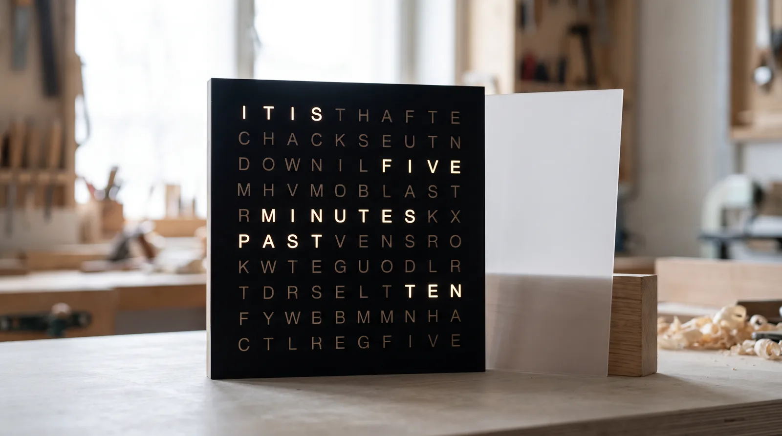 AI-generated
A word clock shows the time as text: behind a panel carrying a grid of letters sit individually addressable LEDs, and only what currently applies is illuminated — “IT IS FIVE PAST TEN”. The electronics for this are well documented and described in many build guides. What it hinges on is the face.
It has to do three things at once: let the letters through legibly, reliably black out everything else, and match the LED grid exactly. Each of these three requirements has its own pitfall.
Two constructions
In the cut face the letters are cut out completely, with a light-diffusing sheet behind them. This gives the highest contrast — the letters glow clearly, everything else stays black. It is the most widespread construction.
In the engraved face the letters remain in place and are only removed down to a thin residual layer through which the light shines. This needs no second part and is mechanically more stable, but it requires a material that transmits just enough at that point — and the residual thickness is hard to hit. For a first build, the cut face is the safe choice.
Stencil typefaces are made precisely for this: they interrupt the outline at an inconspicuous point so that the inner area stays connected to the rest. If you take a normal typeface and draw the bridges yourself, make them at least 1 mm wide — any narrower and the kerf eats them away, and the inner part falls out after all.
The alternative is to lose the inner part deliberately and work with the diffuser: if the inner part is glued separately onto the diffuser, the letter looks correct. With over a hundred letters, however, that is a lot of handwork.
A honeycomb grid between the LED plane and the face solves this: a lattice of thin webs giving every letter its own chamber. It can be cut as an interlocking grid from the same material — two sets of slotted strips pushed into one another, like a bottle carton.
The kerf rule applies to the slots: if both strips are 3 mm material and the slot is drawn at exactly 3 mm, the joint will sit with noticeable play. Draw the slot one kerf narrower — and remember that the material thickness itself varies.
The grid has to work out
The letter positions have to coincide with the LED positions, across the full width. The usual error is to dimension from letter to letter: across eleven columns, eleven roundings add up to a visible offset at the edge.
Instead, dimension every position absolutely from a reference corner. If your LED strip has a pitch of, say, 16.7 mm, the tenth LED is at 150.3 mm — not at “nine times roughly 16.7”.
And plan the margin generously: the face is usually somewhat larger than the active grid so that a frame covers the edges. That overhang is the buffer in which small deviations disappear.
Choosing materials
Black opaque acrylic has proven itself for the face — it lets no stray light through and gives the highest contrast. Frosted or milky material suits the diffuser; clear acrylic scatters too little, so you see individual LEDs as points rather than an evenly glowing area.
If you want the face in another colour, check beforehand whether the material is genuinely opaque when unlit. Many coloured sheets appear opaque but transmit enough light for the switched-off letters to shimmer faintly.
How to proceed
- Measure the pitch of the LED plane and calculate the overall dimensions from it absolutely.
- Set the letter grid in a stencil typeface and check the counters.
- Convert the letters to paths — fonts that are not converted will not be cut.
- Draw the separating lattice as an interlocking grid, slots one kerf narrower.
- Have a test field with a few letters cut and hold it against the LEDs before the whole face runs.
Frequently asked questions
- Why does the middle of the O fall out of my word clock face?
- Because a cut-out O consists of two separate parts. Use a stencil typeface whose counters are held by bridges, or draw the bridges yourself — at least 1 mm wide, otherwise the kerf eats them away.
- Why do neighbouring letters glow along?
- The light travels sideways between the LED plane and the face. A honeycomb lattice of slotted strips gives every letter its own chamber and makes the text crisp.
- Which material for face and diffuser?
- Black opaque acrylic for the face — highest contrast, no stray light. Frosted or milky material for the diffuser; clear acrylic scatters too little and you then see individual LED points.
- How do I avoid offset in the letter grid?
- Dimension every position absolutely from a reference corner, not from letter to letter. Across eleven columns the roundings otherwise add up to a visible offset.
Read on
Sources
- Our own production: word clock faces, stencils and diffusers, 2019–2026
- Order analysis from 2019: 108 customer profiles relating to word clocks (EUR 18,845)